Link to site: HERE
Category: Multimedia Learning (Page 1 of 2)
The main practices for creating a meaningful story based on the article by Nayomi Chibana are and EDCI 337 Week 9 notes:
- Adding engaging visuals for the audience
- Telling a personal or powerful story to captivate the audience, bring characters to life
- Creating suspense through tone
- Pose questions to incorporate active learning
- Show the audience about an event in the story by transporting them to a scene through speech
- Build to a STAR (something they’ll always remember) moment
- End with a positive takeaway or learning outcome

Reflecting back on my learning experiences, a learning situation where the use of video would be most effective I think would be chemistry labs. Looking back at my first year experience in chemistry, all the materials were still super new as well as the names of different tools in the lab. Even though we were all given a lab manual, I found that there were no pictures. I think if a video of how to do the lab/ steps was showed at the beginning of the lab, and it showed what the tools/ materials looked like as well, the lab would have been a less stressful experience LOL. The addition of some sort of cheat-sheet as well with images next to the steps in the lab would have also been more helpful for us visual learners. Overall, visuals/ images and better, simpler, descriptions would have benefited many students in these labs and in the lab manuals.
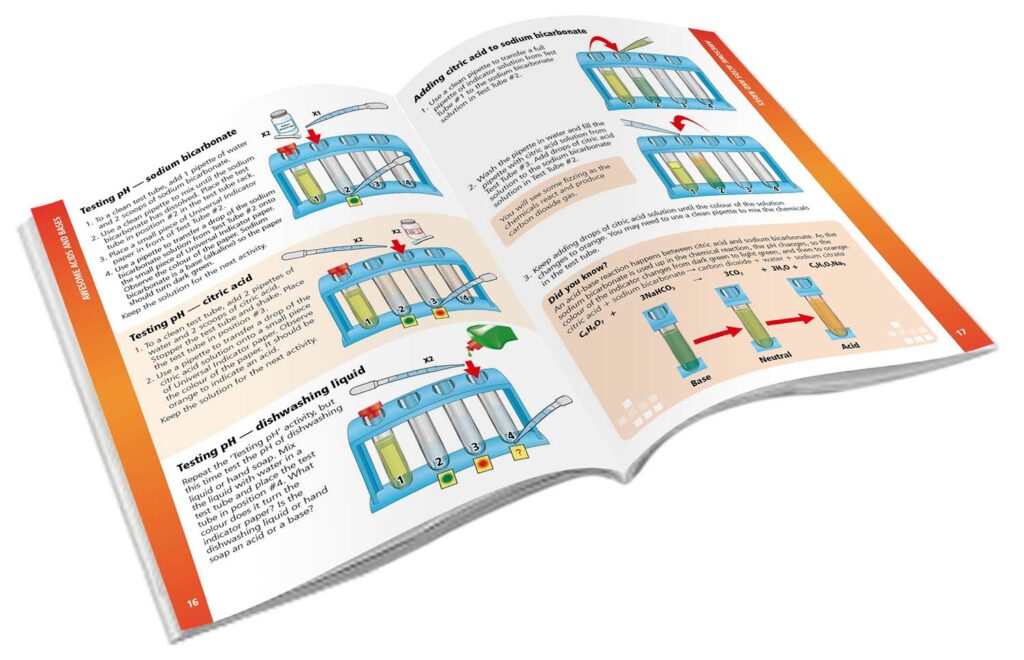
step-by step instructions
For this week, I have chosen to attach a short storyboard script on the steps to helping a camper at summer camp who might be feeling homesick. I thought of doing this learning experience as a short story as I have personally had to help many young campers work through homesickness and any upset feelings that they may have when at summer camp. In my assignment I aimed to bring personalization to the story, transport the audience to the setting using visuals and descriptions of the scene.
Please enjoy my first attempt at a storyboard attached below!
Storyboard Assignment:
Responding to the discussion questions:
In Rich McCue’s example of storytelling, what senses does he appeal to in his story? Which of the guidelines does he follow? Are there any that he doesn’t follow?
Reviewing the example of story telling by Riche McCue, the first thing he mentions in his video is the feel and smell of a new computer out of the case. He uses the visual and auditory elements to bring the audience into the setting of the story. This makes the story more personable and realistic as we have all experienced that feeling. The video continues to use visuals to tell the story and uses the personal experience of a student to make the overall goal/ learning outcome of the video more impactful. Using good tone, visuals with auditory text, and keeping the video short, Rich was able to make an effective video using a personal story of why you should back-up your laptop. The one thing I did notice that was missing was subtitles/ captions to make it more accessible. Although those can also be turned if you wish through YouTube.
Describe a meaningful learning experience that started with a story. What made it impactful for you? Did you recognize any of the storytelling techniques reviewed this week?
In past biology classes I have had profs start lessons or introduce topics with a personal story from their own learning experiences. These stories included the profs doing field work and collecting biological samples along with images of them doing this field work! This personalization aspect to the lesson also showed us the possible job opportunities we as biology students have! Some of the main storytelling techniques used include adding visuals elements and focusing on learning outcomes. The profs sharing their own experiences in the biology field helped us students better understand why we might be learning a particular topic/ method in class!
In the reading this week, 7 Storytelling Techniques Used by the Most Inspiring TED Presenters, which of the presenters did you find most compelling? What technique(s) did you recognize in their talk?
After going through this reading, I thought the second TED talk about domestic violence was very impactful. I found her tone of voice and experience on the matter powerful. The use of some props made the story real and had a powerful impact on the audience as well. Using Mayers personalization principle, the talk was very well done and brought a very important topic of conversation to light.
What storytelling techniques have you used instinctively and which ones require more work for you? Which techniques will you focus on moving forward?
When I tell stories to my friends I love to use expressive body language and different tones of voice. Although, I do find that I like to talk A LOT. So I guess moving forward, some of the storytelling techniques that I could work on are being more precise and keeping the story on-topic. These follow the overall guidelines when it comes to storytelling of “Keeping it short” and “Focus on learning outcomes” / the goal of the story.

References:
Chibana, Nayomi (2015). Storytelling Techniques Used by the Most Inspiring Presenters. A collection of storytelling techniques and short presentations by skilled storytellers.
Shed, Nathanial (2019). Helping the Homesick Camper. American Camp Association. https://www.acacamps.org/article/camping-magazine/helping-homesick-camper
McCue, Rich. (2021) Why you should back up your Laptop. University of Victoria Library. Digital Scholarship Commons. from EDCI 337. YouTube. https://www.youtube.com/watch?v=_NIqt5y1wgw
Comment made on: Meira’s Blog
Hi Meira,
I enjoyed reading your post! I have also always loved watching TED talks, I find them so fun and engaging especially in a learning environment. I also remember watching the TED talk by Will Stephan as I always found it so funny! I thought that was a perfect example for you to include in your post to demonstrate the different techniques of how to tell a story. I think your opinion of the inclusion of a storyboard/ script for these talks is a great idea. Adding an easy way to visually represent ideas will also make the talks more accessible for others 🙂 Overall, great job, thanks for your blog post!
The goal of this screencast video is to teach educators, learners, and whoever is interested in learning more about our ocean, how data is collected and stored. In my screencast I teach the audience about one of the various tools in Oceans 3.0 and how to search the annotations in underwater ROV footage. This basic technique will allow students and educators to explore our underwater world and expand their research skills.
Using learning principles that we have discussed so far, I have learned that humans need to be engaged in the learning process and it takes time for us to learn. Based on the 3 main cognitive principles discussed in week 2 of Mayers Learning theory, including; dual learning theory, limited capacity, and active processing, my goal is to create an easy to follow, instructive screencast video. The dual learning theory is the ability for our brains to process and link words and images, based on visual stimuli. In this brief tutorial of how to use Oceans 3.0, I really wanted to focus on the dual learning theory as the screencast includes visuals and auditory instruction. Thinking of the limited capacity and active processing theory’s, I wanted to keep my video brief and to the point as much as possible.
In my first attempt at a screencast, I was still new to the online tool, I think I might have word-vomited a little bit and wasn’t as concise as I could have been! Focusing on the redundancy principle, I decided in my new screencast to start with some information background on Oceans 3.0. During this intro, included some brief slides where learners can listen and also read the main points. I added an image next to the definition of what Oceans 3.0 does to focus on Mayer’s contiguity principle of keeping words and pictures close to each other. I believe that adding this will also help visual learners better understand and picture what the “underwater networks” look like. Also, thinking about extraneous load, I also chose to keep sentences very much to the point and on topic.
I chose to keep the similar technique of zooming into where the audience can click to follow along and using my mouse to highlight/ circle main parts of the resource. This technique follows Mayer’s Signaling Principle as it helps highlight key information of the tool!
SCREENCAST ATTEMPT 1:
UPDATED SCREENCAST:
SeaTube V3 in Oceans 3.0 by Ocean Networks Canada.
Reflecting on week 4 material where we explored accessibility in multimedia, in my new screencast I added captions and described the visual elements where I thought it would be best! To update my screencast I chose to use a new online tool Veed.io which adds captions/ subtitles to the video. The online tool worked perfectly to help make my video more accessible, although I could not remove the watermark for the program unless I got a membership.
I also thought it would be best to add the visual written main points at the beginning for learners to read and follow along or scroll back to if they missed something. The addition of the slides I believe make the video more accessible for visual learners.
In my new screencast on how to use Oceans 3.0 I also aimed to highlight how this tool can be used. The Oceans 3.0 data portal is great for teachers to show students our oceans, learn about ocean technology, and understand how data can be collected and stored! For any student interested in our ocean, they can explore the site and discover new marine organisms. There is new data added to the site constantly which means a never ending stream of new things and data to explore.
References:
Loveless, Becton (2022). “Dual Coding Theory: The Complete Guide for Teachers.” Education Corner, https://www.educationcorner.com/dual-coding-theory/ .
Making Videos Accessible: DO-IT Video. (2017). DO-IT: Disabilities, Opportunities, Internet Working, and Technology. https://www.washington.edu/doit/videos/index.php?vid=86 .
Ocean Networks Canada. https://www.oceannetworks.ca/ .
Wisc-online (2017,2018). Mayer’s Principles to Reduce Extraneous Load: Redundancy Principle, Coherence Principle, Signaling Principle, Contiguity Principles. YouTube.
Made on: Bradens EDCI 337 Blog
Hi Braden!
I enjoyed reading your blog post. I like how you incorporated visuals generated by AI into your post as well. I find it always so fascinating viewing AI generated imagery, as it looks very utopian! I liked how you used your experience in a past course to describe the impact of storytelling and your better understanding of course content because of this method. I definitely agree with your discussion of bringing real-life examples into the classroom, and how helpful they can be for understanding. Thank you for the blog post!
Merrill’s 5 principles of instruction:
- Learning is promoted when learners are engaged in solving real-world problems
- Learning is promoted when existing knowledge is activated as a foundation for new knowledge
- Learning is promoted when new knowledge is demonstrated to the learner
- Learning is promoted when new knowledge is applied by the learner
- Learning is promoted when new knowledge is integrated into the learner’s world
After learning and reading over Merrill’s different principles, I now understand why university courses are structured a particular way. I also have noticed why I might have learned material better throughout online school assessments compared to in-person assessments. As a biology major, a lot of the course assessments are multiple choice. Although over online school, the questions shifted to more long-answer and real-life scenario questions. As much as students might not be a huge fan of long answer questions, sometimes it is better to be able to explain your thoughts and problem solve to get to the answer. The skills behind this decision making process are more applicable in the real-world problems. I also now understand why you might need a prerequisite class prior to taking another class, as the knowledge you will have learned in the course is the foundation to build on new knowledge in the next course! Again, another one of Merrill’s principles at play.

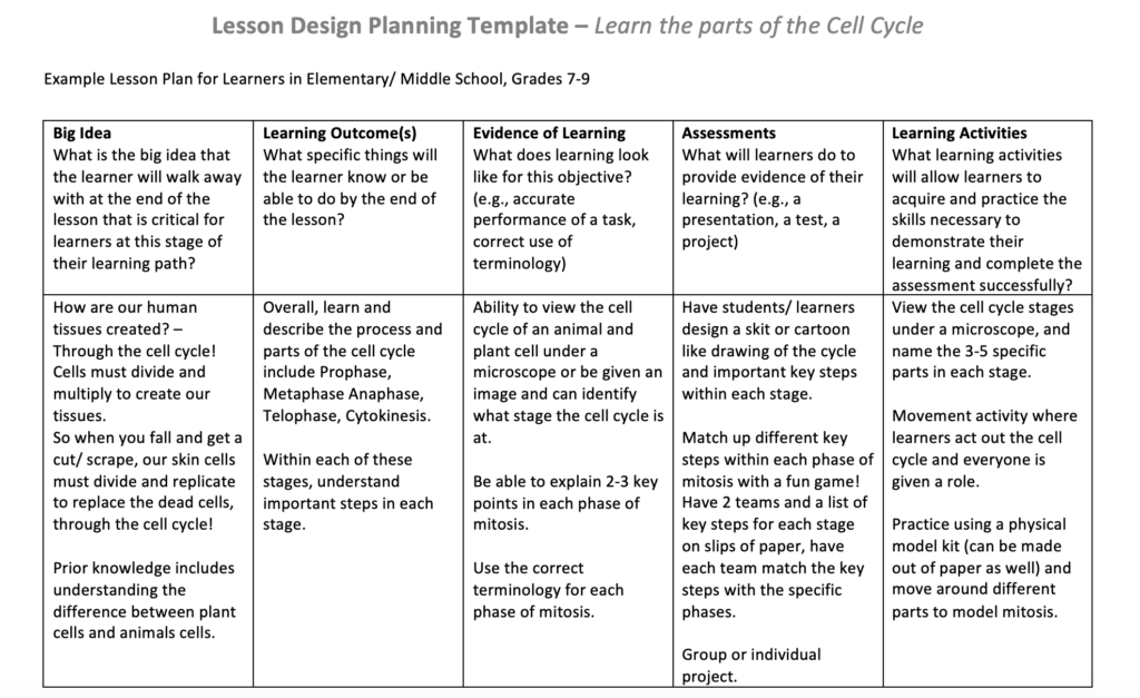
As defined by Shelly Moore in her video, backwards design is the process of identifying the goal and making a plan to meet that goal. It starts with the goal that the educator wants the students to meet, and then creating assessments based on that goal. Then once the goal and assessment is clear, you then create the lesson plan to reach that goal. Below I have attached an example lesson plan that teaches youth about the parts of the cell cycle. As I have never been in the position to have to create a lesson plan for learners, I did find this task challenging and appreciate any feedback in the comments!
LESSON PLAN ASSIGNMENT:
What authentic problem would you use to design a lesson using Merrill’s principles? What media or multimedia (interactive or not) would you create to support it?
Looking at Merrill’s principles, the main points that jump out to me are “solving real-world problems” and “new knowledge is integrated into the learner’s world”. Looking back at my courses taken during online school/ COVID, I felt that for some of my classes profs took more time in creating assessments and incorporated more real-world examples into tests. Majority of the online assessments were also open book, which helped us as students, expand and improve our note-taking skills and research skills. It is also always helpful at the beginning of the semester for all my courses that we reflect back on what we had learned the previous years. This allows us to think back to past knowledge learned and for us to be “activated as a foundation for new knowledge”.
If I were to create a lesson using Merrill’s principles and involve a piece of multimedia, I would create an interactive lesson which includes hands-on activities and online videos with a reflection piece for assessment at the end. I am not quite sure yet what the lesson would be about, although I would take from my experiences as a learner and apply it to my lesson assessment. Using interactive media where the learner can get more hands-on experience I believe will provide a better and more inspiring learning experience, as well as be inclusive to those that are visual, auditory, and tactile learners. I also really found assessments that were open-book more helpful for my learning and understanding of the topic than closed book multiple choice tests. So as an assessment for my lesson, the learner would have to do research and a presentation to show their learning or create multimedia to express their learning.
Where do you see constructive alignment and backward design used in this course or another course you are taking/have taken? Is there anywhere where it seems to be missing?
Constructive alignment refers to the alignment of our learning outcomes, assessments, and activities and is also a central to the concept of backward design! Defined earlier, backwards design is the process of identifying the goal and making a plan to meet that goal.
I think the process of backwards design is missing within the sciences. From my learning experiences, there needs to be more of an activity based approach or different way of assessment to make the learning environment more encouraging for students. I think that this course (EDCI 337) is a good representation of backwards design and constructive alignment as we are given the task at hand (blog posts) and the tools on how to constructively answer the questions for the blog posts.
After reviewing the material for week 8, I am actually surprised how far AI technology has actually come. Yes, I knew somewhat about the AI creating art-work through what I saw on TikTok, although I didn’t know that this technology was having such an impact on young artists. Generative Artificial Intelligence is the process of AI generating art and text, based on previous information. Looking at the Large Language models (LLMs), based on the article by Rushton it is said that LLMs have just become “really good at paraphrasing”. As noted in the example in the article, the system lacks the understanding of the text being written.
Looking over the various AI tools for the week to explore, of course I wanted to try out ChatGTP as it has been all over the news. I also noticed that Quillbot was also listed as an AI tool. I have actually been using Quillbot for quite some time and never thought of it as a form of AI. I have always struggled with writing words down on a page in a way for the sentence to make sense and get the point across. So I have turned to Quillbot in the past to help me with grammar in my writing, putting things in chronological order, and organizing my thoughts. Overall, it has been a very helpful tool when I don’t have a roommate around to read over my writing for past tense vs present tense.
Having never tried using the ChatGTP program before, I started by asking a funny question of “how long can I keep lunch meat in the fridge”, just to see what it would say. Not completely sure why I chose that question to test the program. Of course my next question was “summarize the first harry potter movie”……Anyways, I was pleasantly surprised when it responded with a very detailed instructive answer. Now, if I have a question about how to cook food, I no longer need to text my mother (LOL)!

Using ChatGTP, I attempted promoting the program with the questions for the blog post to see what the result would be. I have attached the following responses the program gave me:
What guidelines do you think should be in place to guide their use in an educational institution? What factors should be considered?
Guidelines for the use of AI in educational institutions should be established to ensure that the technology is used ethically and effectively. The factors to be considered include privacy, security, accessibility, and fairness. Educators should be trained to use the technology effectively and to address any potential biases in the data used to train the algorithms.
How might the use of these tools create a more inclusive learning experience? Who might be excluded?
The use of AI in education can provide personalized learning experiences that can benefit learners with different learning styles and abilities. However, AI tools may exclude learners who do not have access to technology or who are not familiar with its use. It is important to ensure that access to technology is not a barrier to learning.
What ethical concerns do you have (or not have) about the use of some of these tools?
Some ethical concerns about the use of AI in education include the potential for bias and discrimination in the data used to train the algorithms, the privacy and security of student data, and the potential for the technology to replace human teachers.
What might you use AI tools for moving forward? What would you not use them for?
AI tools can be used in various educational settings, such as adaptive learning, intelligent tutoring systems, and language learning. However, it is important to consider the ethical implications of their use and to ensure that they are used in an inclusive and effective manner.
Where do you think these tools will be in their evolution in 2-3 years’ time?
AI technology is rapidly evolving, and it is difficult to predict exactly where it will be in 2-3 years’ time. However, it is likely that AI will continue to be integrated into education, and new tools and applications will be developed to enhance teaching and learning. The development of more advanced natural language processing and machine learning algorithms is likely to further improve the effectiveness of AI in education.
It was wild for me to see just how easy it was for the program to generate the answers to these questions. I now understand why some profs/ schools are skeptical of the technology.
I also choose to tryout some of the other AI tools including “Tome”. Below is attached a presentation that AI has put together about how to be a great Summer Camp Leader. The one thing I first noticed about the presentation is the very interesting artwork displayed in the slides. I also noticed that the slides had a lot of paragraphs, and the one thing when giving presentations is to have slides with short bullet points. What interesting features did you notice about the AI generated presentation? Link HERE.
References
Merrill, M. D. (2002). First Principles of Instruction. ETR&D, 50, 3. pp. 43-59. https://www.james-greenwood.com/instructional-design/toolkit/merrill/#:~:text=The%20premise%20of%20Merrill%E2%80%99s%20first%20principles%20of%20instruction,principles%20are%20necessary%20for%20effective%20and%20efficient%20instruction.%E2%80%9D%28p44%29
Carolina Knowledge Centre Team, “Teaching the Cell Cycle and Mitosis.” Carolina Knowledge Center.https://knowledge.carolina.com/discipline/life-science/teaching-the-cell-cycle-and-mitosis/
Moore, Shelly (2019). Backwards Design: A great way to move forward. YouTube Video. Backward Design
Stable Diffusion (All images in blog were created using this tool)
Rushton, Edward (2023), The Great LLM Debate: Does ChatGPT Really Understand?.LinkedIN.
ChatGTP
Comment made on Mirai’s Blog.
Hi Mirai!
Thank you for your blog post! I liked the little slideshow screencast you put together, and incorporated into your post for us to get to know you, super fun! I also really enjoyed reading your post and your ability to relate the course material to your personal experiences. I 100% agree with the increase in extraneous load we students were under when classes were delivered online, it was definitely a quick learning shift. Most of my friends were not huge fans of online learning, although I somewhat didn’t mind it. Even though it was a little unorganized at the beginning, the structure got better overtime and allowed us to learn how to prepare for assessments in a different way than in-person school. So in that case, I also agree with your mention that online learning can definitely be beneficial and developed into a great learning opportunity/ tool!
For my next blog post I wanted to start with my thoughts on the recent lectures/ reading material. I find it very interesting as discussed in the youtube video “What is Universal Design for learning?” (Columbia, Centre for Teaching and Learning. 2019) , they mention making things more accessible by recording lectures and encouraging university/ college educators to add closed captions etc. Yet some say that there are no students with disabilities in their class because no one filed a form disclosing. In this case, I 100% agree with this video in that fact that students should NOT have to disclose that they have a disability or need specific accommodation unless they choose, to make a class more accessible for students. I also agree that all lectures should be recorded or lectures have closed captions and that staff/ profs should know how to do this to make their classes more accessible. I have still experienced profs that refuse to record lectures or add closed captions under the assumption that because no one submitted a form through the learning center disclosing a disability, that no one needs that accommodation. Universal design should be taught to professors and educators, and they should be provided with resources to help them make their lectures/ classes more accessible to students. If universal design was taught to educators, maybe they will be more familiar and comfortable using this more inclusive teaching method.
What did you find when you ran the WAVE accessibility report on your blog post(s)? What did you expect and what was surprising? Is there anything you will do differently going forward?
After running the WAVE accessibility report on my first blog post, I learned that I don’t add image captions describing the image or purpose of the image. I also noticed alot of red boxes indicating that the font should be darker in some areas. I added a screenshot below showcasing my experience using WAVE for the first time!
Have you used Text to Speech tools before? Did you find it useful?
Throughout my years in University I haven’t used the Text to Speech tool, although I have used the speech to text tool! I do find the text to speech tool useful as sometimes when I read I tend to get carried off track. This tool will increase inclusivity for those who might be auditory learners, and using this tool could allow me to turn my notes into almost like a podcast! I included a short screencast showing the Text to Speech tool with my 1st blog post!
What does inclusive design mean to you?
Inclusive design to me means, accessibility to all and accommodation for students. It means when students ask for lectures or classes to be recorded or closed captions to be added to the lectures because the prof might be speaking to quickly, the educators are accommodating as possible. Inclusive design is engagement, representation (CAST. 2018) and means not just accommodating to one but to all!
For week 5 I decided to make an infographic in Canva! I am currently working towards my scuba certification and have decided to incorporate what I have learned prior to entering the water! Below is a brief infographic on the final safety check needed for scuba before entering the water.
Which design principles did you use to create your infographic in Canva? Which elements of a ‘good infographic’ were you able to incorporate? What other principles did you consider?
When designing my infographic I wanted to try to keep things easy to read and visually appealing! I also wanted to keep a focus on the underwater theme as it is a scuba diving infographic. Luckily Canva had pre-made ocean themed templates which I modified as needed. Some elements of a good infographic which I included are; consistent style and color choices as I kept to 2-3 shades of blue, 1-2 text fonts, leaving space between the main points, and I tried to keep the imagery as simple as possible. Another design choice I wanted to incorporate is the main title. I made the acronym for the safety check (BWRAF) as clear as possible so the audience would know to remember it.
Graphic design is inherently visual – what additions or modifications could you make to ensure that learners with visual impairments have access to the same information in an online setting?
I believe the best way to make graphics accessible to everyone in an online setting would be to include a recorded component to explain the image. The text to speech tool is an amazing web application that can be added to any website, and I think would be beneficial for someone interested in reviewing a powerpoint or infographic. If it is possible to get a web program that described images or design, that would be 10000% better. A tool that describes the graphic image would give a learner with visual impairments the opportunity to imagine what the graphic looks like.
Throwing it back to high school, I remember some of the first presentations I had to make were, give or take, interesting….. I liked to include lots of colors and pictures and of course animations. After making lots of presentations you soon start to realize that animations are only needed sometimes and not on every single slide, and that it is best to stick to a consistent color pallet to keep things neat and organized for the audience. Throughout the last 4 years of university, I can honestly say that my powerpoint presentation design skills have improved. In biology courses we learn to create simple and to-the-point presentations when presenting experiment results, findings, etc. When presenting graphs, I have also learned the best way to show the audience what the graph is telling us by using animations in powerpoint to highlight important information.

Overall, I continue to grow my skills in making successful powerpoints everyday! By incorporating more shapes and simple contrast into my presentations and infographics, I hope to create an engaging presentation that highlights the main points to the audience, and keeps them entertained.
References:
CAST. (2018). Universal Design for Learning Guidelines version 2.2. Retrieved from http://udlguidelines.cast.org
Columbia, Centre for Teaching and Learning. 2019. Universal Design for Learning. An introduction to UDL and its use in the classroom. Youtube.
Denny, M. (2023). The proper dive Buddy Check – How Do You Say BWRAF? The Proper Dive Buddy Check – How Do You Say BWRAF? Retrieved February 18, 2023, from https://blog.padi.com/how-do-you-say-bwraf/
Johnson, D. (2021). Design and Layout with Canva [Mp4]. https://www.youtube.com/watch?v=g3pdyid7BjU
Comment made at: https://kyuhochang.opened.ca/2023/01/21/hello-world/?unapproved=2&moderation-hash=e44ad0fdbea7815cdfbef17d9ad87840#comment-2
Hello!
Thank you for your blog post! I liked how you incorporated the definitions of a few of the multimedia theories that we learned about in the first week. As you mentioned in your blog “explaining words with supportive pictures makes people understand more easily”, I suggest definitely adding some pictures to your next blog post to make your post even more captivating and interesting to the audience! Expanding even more on your examples and ideas as well and adding your own personal opinions I think could help as well! Overall great job, and as mentioned in the modality principle, many learn better from graphics, so definitely take your own advice of adding pictures with text for your next posts 🙂
Comment made on: https://edci337uvic.opened.ca/2023/01/19/week-1-reflection-questions/#comments
Hi Alexa!
Great first blog post! I enjoyed the use of images to help better understand the content you were talking about. I liked how you listed your examples of each type of media clearly, and mentioned the idea of virtual reality as an evolving technology, including its importance in the future of education! I definitely agree with this idea, as over the last couple years we have seen such a huge increase in the use of technology for education. I can just imagine how much more technology and the use of online tools is going to continue to expand, especially in schools. Thanks for sharing!
Recent Comments